Natasha-2
[ Back to Index | Home | Previous Image | Next Image ]
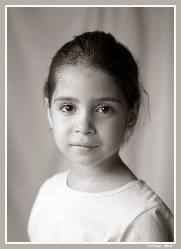
Comments by Sandra Koz on Mon, 08/10/09 01:08 Or the same one in BW:
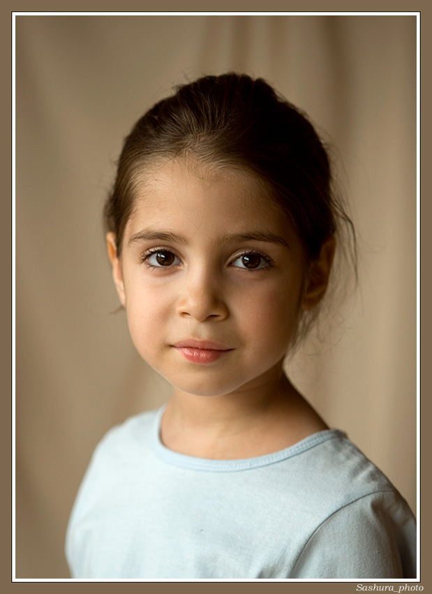
Comments by Sandra Koz on Mon, 08/10/09 01:09
Comments by Pietro Cecchi addendum on Mon, 08/10/09 05:01 In my opinion:
Comments by Jan Bjorklund on Mon, 08/10/09 09:09 The perspective (shooting from head level of the child), the catchlights in the eyes (which make them seem luminous) and the pose (seems so comfortable as Pietro comments) make for a striking portrait. I would have cropped up slightly from the bottom edge to the top of V of material on the left of the picture. I think I prefer the b&w version (the eyes have more of a luminous feel in b&w). Comments by Jeff Dye on Mon, 08/10/09 10:37 She's a good model. Nice, relaxed expression and I like her direct look. I like the B&W. I'd
Comments by Mo Fridlich on Mon, 08/10/09 11:13 Both are very nice! I have a slight preference for the color version. Comments by Light Grapher on Mon, 08/10/09 15:48 reflector:
Comments by Light Grapher on Mon, 08/10/09 16:27 Just as opinion:
Comments by Kara Williams on Mon, 08/10/09 18:32 I like both versions Sandra. But your b&w version has a special angelic quality that seems to suit the girl's expression and the toning is very pleasant. I agree with Jan's crop suggestion. Comments by Tom Manson on Mon, 08/10/09 22:17 Really striking child and image. Beautiful. Holding the reflector just a little closer may help
Comments by Christopher Azzopardi on Tue, 08/11/09 10:50 Personally, I prefer the colour version. I agree with the above suggestion of moving the reflector closer to her especially since detail is lost in her hair. Comments by Bob Buckles on Thu, 10/01/09 23:00 Just messin' around with your image. As I've said before, she's a great model. There's a filter in NIK filetrs called "Glamour Glow." Thought I'd throw it on to see the effect. Here 'tis.
|
|