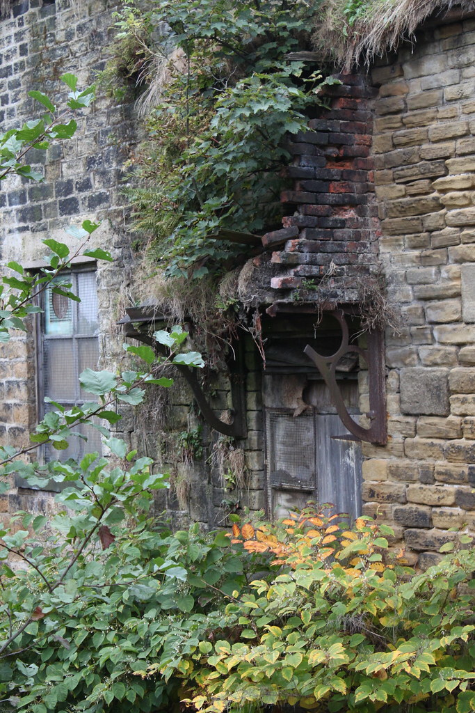
Old Derelict Door
[ Back to Index | Home | Previous Image | Next Image ]
Comments by Jan Bjorklund on Thu, 04/08/10 09:03 I like the textural feel brought to the derelict door by the brickwork and the plants growing over the facade of the building (the feel is enhanced for me by setting the image against a black background color). The words of the poem complement the picture perfectly, in my mind. Comments by Maria Salvador on Thu, 04/08/10 09:14 My monitor asks for a little bit more contrast. A nit to a very nice photo. Love the poem too, both together complement themselves wonderfully. Comments by Sandi MacDonald on Thu, 04/08/10 09:41 A nice find. I like the subject but maybe add a little more contrast as suggested by Maria might help? Comments by Jeff Dye on Thu, 04/08/10 11:06 Ditto the above. Just don't go too far with contrast. Might look good in B&W. It's also a
Comments by Alias on Thu, 04/08/10 12:40 Not only is the pixel size quite large ,
Comments by PaulB on Thu, 04/08/10 14:59 Tried Autolevels. Any better?
Comments by Sandi MacDonald on Thu, 04/08/10 17:05 It looks better to me. Comments by Linda Frey on Thu, 04/08/10 17:07 Looks like a dangerous door to attempt to open. All those bricks and dirt could come tumbling down on your head! Just as well to let the trees grow up in front of the door. Comments by Jonathan Lange on Fri, 04/09/10 22:58 Not to be mean, but it's kind of an ugly shot. I mean, it's not really any fault of yours -- other than the fact that you took it -- but the lighting and subject are about as exciting as a bouquet of weeds.
Comments by kathrn on Sat, 04/10/10 00:30 NOPE. Comments by Ramona on Sun, 04/11/10 04:23 I like this, it almost looks like this building has a face, very nice :) |
|
